On September 17, 2016, I got engaged to the love of my life. It was a day of great joy and excitement for the future. On September 18, an interesting thing happened: that jubilation was suddenly replaced by the realization that we had three and a half months to plan a wedding. It was time to get to work!
Naturally, my mind jumped straight to my career as a Tableau consultant. I’ve seen people at all levels of an organization utilize Tableau to streamline their role, provide insight into their decision making and learn things they didn’t know before. I asked myself, “What if this were possible as we plan this wedding? What sorts of things will I miss if I don’t visualize my data? How will my decisions be impacted if I do?”
The Planning
As with any set of dashboards, I started by asking myself a few questions:
- What questions does the user need answered?
- Where does the data for this dashboard lie?
- Who will be using the dashboard?
- What device will the user(s) be interacting with the dashboard on?
Since Claire and I were the only users of this dashboard, these questions were quite easy. I knew that we wanted to begin by analyzing two key areas of our wedding: the to-do list and the guest list. Once this had been decided, it was time to get the data in order.
The Data
New in version 10, Tableau allows users to connect to Google Sheets. This was key as we planned the wedding together – if one of us received information or completed a task, we could edit the Google Sheet and the change would immediately flow into Tableau.
Here is the list of sheets we created:
- Budget
- To Do List
- Guest List
- Address List
- Gifts Received
Analyzing the budget and to-do list was simple – connect Tableau and start visualizing. But the guest list was joined to the address list so we could geographically analyze our data. Feel free to check out anonymized versions of the data here.
The Dashboards – To-Do List
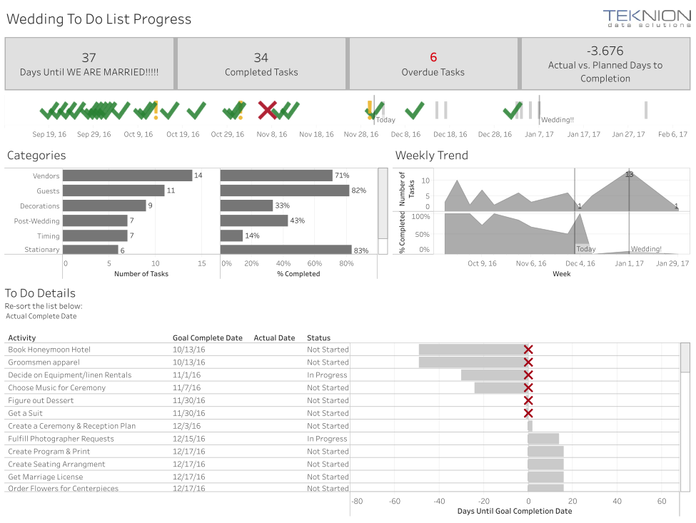
The first dashboard I created was the to-do list dashboard. We had three months to plan a wedding, so we had to be on top of our tasks, and we needed a plan. This dashboard needed to help us answer these questions:
- Which tasks are we behind on?
- Which tasks will we be working on next?
- When will we be busiest with the wedding preparations?
The structure of this data is pretty simple – each row corresponded to a single task, which had a goal complete date. Once it was completed, we added an actual complete date.
I relied heavily upon the KPI shapes in Tableau for this dashboard – they allow users to quickly and effectively see where they are excelling and where they are struggling. When you look at the dashboard you’ll notice that we started off strong, but struggled in keeping up with tasks for the middle couple of months.
View the To Do List Dashboard Here.

The Dashboards – The Guest List
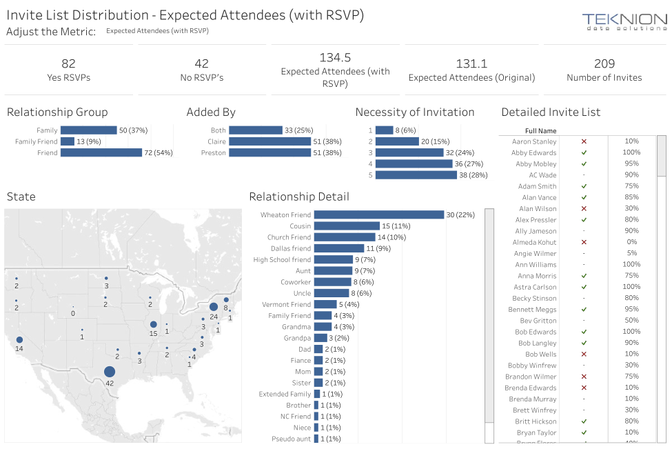
With the planning of any wedding, one of the largest challenges is slimming down the guest list, and our wedding was no different. Our venue could fit no more than 200, our budget could fit no more than 140 and our first pass at a guest list included 300 people. Thankfully, we had a visual analytics tool at our disposal, so we could make data-driven decisions to narrow it down.
To assist in narrowing the list, Claire and I added the following fields to our guest list data:
- Relationship: How do we know them?
- Added By: Who knows them best?
- Necessity of Invitation: On a scale of 1-5, how necessary was their attendance?
- Likelihood of Attending: As a percentage, how likely is this person to attend?
View the Guest List Dashboard Here.

The Necessity of Attendance and Likelihood of Attendance fields were most useful in narrowing the list. The likelihood of attendance could be summed to give us an expected value, and the people with a low necessity of attendance were great places to start the conversation of narrowing our list.
As we narrowed the list, all we had to do was remove them from the Google Sheet, and they would no longer be included in our totals. Once our expected value down to 130, we knew we could stop removing people and send out our “Save the Dates.”
As we received RSVPs from our guests, we added a 1 or 0 into the Attending field. A simple parameter then allowed us to use this same dashboard to analyze the distribution of our guest list, and at any time we could see who had RSVP’d, who hadn’t and who we still expected to give us a yes.
The Dashboards – Other
Throughout the planning process, we made two additional dashboards (which realistically aren’t as exciting). These were:
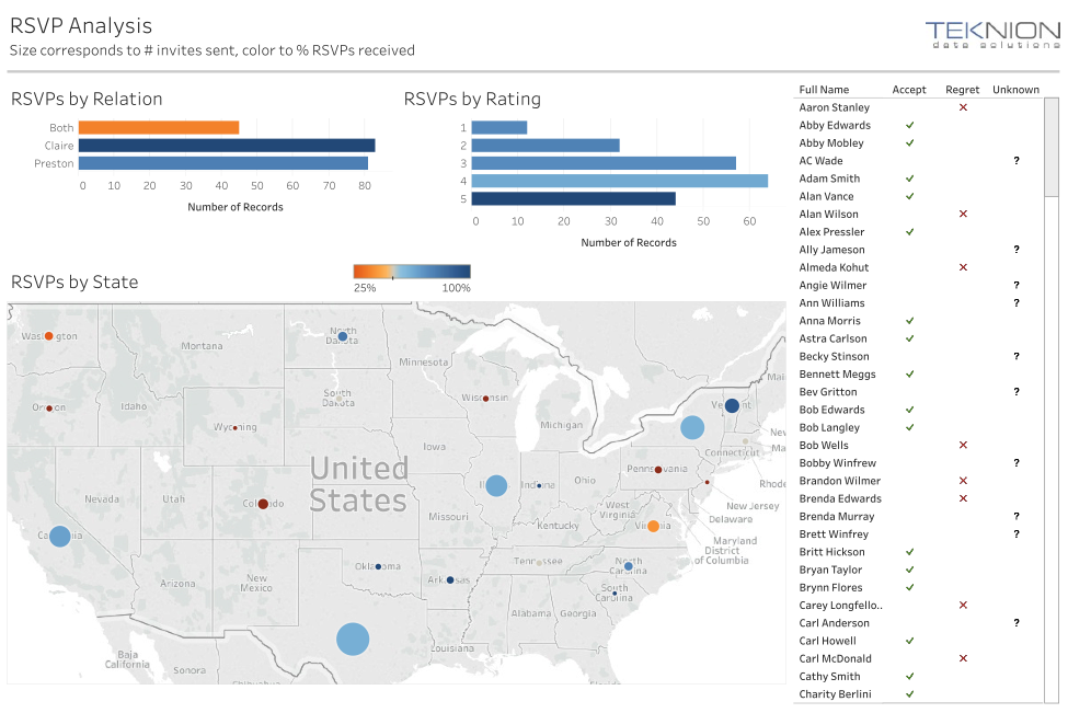
- RSVP Analysis: This was helpful as we neared the RSVP deadline to find who we needed to reach out to. View Here.
- Budget Tracker: We had a budget of $10,000 for the wedding; as we made purchases, we could see how they impacted our overall spending against budget. View Here.

![]()
Final Thoughts
Claire and I effectively used Tableau to make data-driven decisions while planning our wedding, and it was a large reason we could plan the wedding in three and a half months while each working full time.
Are there areas of your business that you currently aren’t making data-driven decisions? Are there areas that you don’t have visibility into your data? If so, Tableau is for you. Download a free trial here.
About the author

Preston Howell
Former Director, Private Equity Solutions | ProServ Market Lead @ Resultant


