
As you may already know, Tableau 10 has been out since August. If you haven’t had a chance to dive deeper into the latest version, you might not be aware of some of the software’s pretty cool new features.
From defining custom territories and filtering across data sources to highlighting data in context and more, visualizing your data has never been easier.
Want specifics? Here are five new features in Tableau 10 that you’re sure to love:
1. Use Clustering to Uncover Insights That You Couldn’t See Previously
For starters, Tableau 10 lets you quickly spot patterns and group your data with drag-and-drop cluster analysis. It does this via a K-means algorithm that splits the data into K segments. Here’s how Bora Beran, Program Manager at Tableau Software, demonstrates clustering in Tableau 10:
“In the toy example below, algorithm finds two groups with means 49 and 130 and assigns each point to the nearest mean. For example, a data point valued 85 would belong to the cluster on the left since it is closer to 49 than it is to 130.
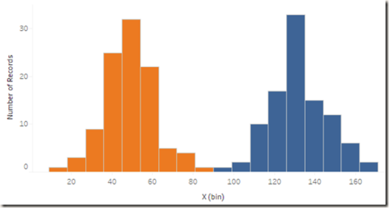
We can clearly see that there are two groups by looking at the two humps in the histogram. There is no clear gap that could be treated to visually separate the data points however. K-means helps with the decision on where to split. Below is an example of what this might look like in 2 dimensions.”
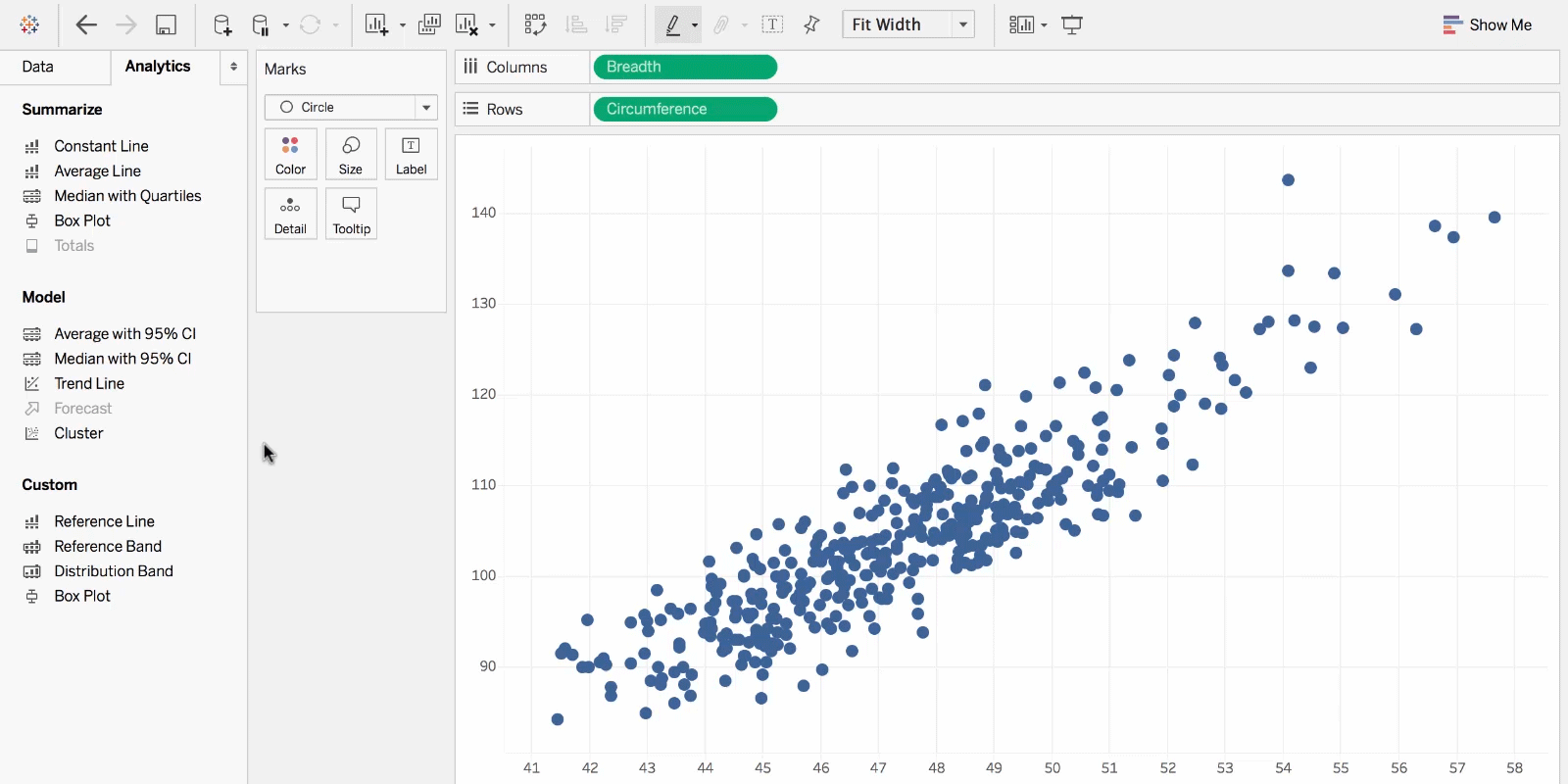 A simple scatterplot allows you to see correlation between two variables. Clustering allows you to define as many variables as you want. For example, you might want to see how customers might be grouped based on order amount, average items per order and total sales amount.
You can also use clustering on any type of visualization to explore additional relationships. Here is a video demonstrating how clustering can be used to find groups of houses based on variables such as price and size. When used on a geographic visualization, you can start to see how certain neighborhoods are predominately one type of house (and you might even find some good real estate investments!).
2. Join Together Data Sources to Expand Your Analysis
Another feature involves integrating multiple data sets. (After all, using your data to reveal truth sometimes requires more than just one set.) Tableau 10 makes this easy by bringing together data sources via cross-database joins and giving you the ability to trade in parameters or filter actions for cross-data source filters. Take a look at this blog from Tableau to see how you can use this exciting feature to expand your analysis capabilities.
3. Use Cross-Database Joins to Reshape Your Data
Often you’ll find that you have data spread out across various sources. For example, you might have your primary database hosted on SQL Server, a legacy system using Oracle, some supplemental data in Excel and a couple of shared Google sheets documents in the cloud. Tableau cross-database joins allow you to bring these (and many other) sources together as a single data source.
Publish the integrated data source to Tableau Online or Tableau Server to collaborate with others. In addition to expanding your ability to connect to and analyze data, cross-database joins let you reshape your data as well. To learn how easy it is to make your own integrated data source, check out this Tableau blog.
4. Create Your Own Custom Territories — Visually
The last two features are connected. If you’ve ever wanted to create geographic data using data built into the geocoding database, now you can! This feature lets you do things like:
As Tableau states on one of its recent blogs, “simply select marks on a map to create groups. Rename your groups to represent the names of your territories, and remove the lower-level geography from the viz. Voilà! Your custom territories will render on either a point map or a filled map.”
5. Create Your Own Custom Territories — Dynamically
Sometimes your data already contains the definition of territories. While creating the groups as stated above makes ad-hoc analysis easy, if you already have a field that groups recognized geographic locations together, simply use the drop-down menu on the field in the data pane to tell Tableau about the geographic relationship.
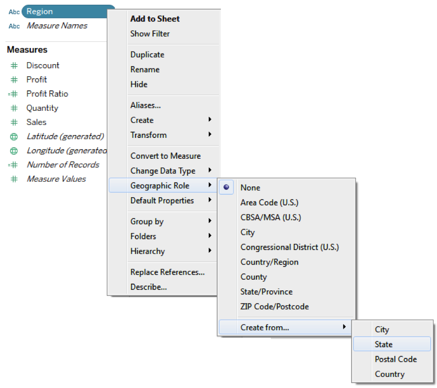
Once you’ve done that, you can use the field to visualize your geographic territories and never have to worry about adjusting the groups manually. Even as new territories are defined and existing territories change, Tableau will dynamically adjust the visualization based on the current data.
These are just a few of the fantastic new features in Tableau 10. If you’re interested in testing them out, consider downloading a free trial today.